- Reading time: 4 mins
- Topics:
- Website Design & Development
- Uncategorized
Each passing day it is becoming more and more obvious that my prediction of smart phones as a passing fancy might have been inaccurate. Obviously people seem to enjoy their phones and more and more web browsing is occurring through phones and tablets. So, of course, you want to make that your website is going to look good and be a pleasant experience for this growing segment of users.
You likely have a smart phone yourself. That gives you a handy way to test your website on a phone. But there are so many different screen sizes that, even if it looks good on your device’s 6½” screen, it might not work as well on a more constrained 4.7″ model. And maybe you do not have a tablet. How can you be sure the site will work well in that environment?
Luckily, with the browser on your computer, you can simulate how your site behaves on any myriad of different devices. While it will not be a perfect re-creation of using your phone, you can look for any glaring problems and assure a pleasant mobile experience.
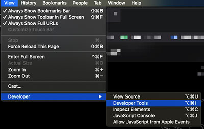
Most browsers have a suite of tools to aid in website development. I am going to focus on Google’s Chrome browser but all major computer browsers like Safari, Firefox and Microsoft Edge, have similar functionality. Let’s open the developer tools up on my machine by going to View > Developer > Developer Tools:

Choosing this menu item, or its keyboard shortcut equivalent, will pop open the tools within your current browser window, or in a new window. Developer Tools are organized within tabs and you’ll see a bunch of options along the top of your tool area.

We actually aren’t going to be looking at the tabs displaying full words, though. What we are looking for is the icon just to the left of the tabs that looks like two small rectangles representing a tablet and a phone.

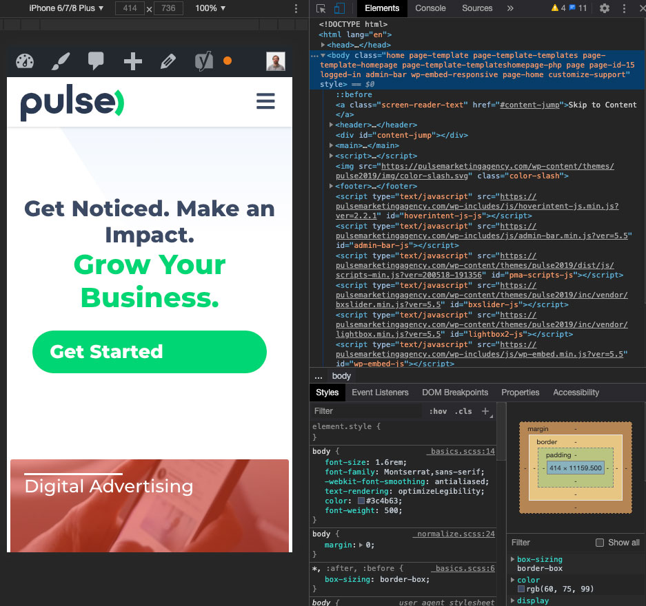
This icon toggles what Google Chrome calls the “Device Toolbar.” Clicking this icon will shift your browser into Responsive Mode where you will be able to test the currently open page on different screen sizes. At the top of your browser window, you will see a toolbar allowing you to set the dimensions to test your page with among other options.

Actually, you probably aren’t aware of the pixel dimensions of your iPhone or Android phone. Thankfully, Chrome has a bunch of pre-set “devices” available for you to choose from including popular iOS and Android devices. These are available in the dropdown menu on the left-hand side of the Device Toolbar. Selecting an item will change your viewable area’s dimensions to match the screen size of the selected device.
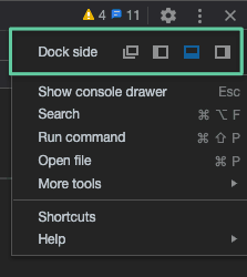
Because your browser window likely won’t have enough room to fit the device’s dimensions at 100%, there is an option to zoom the responsive area so you can fit the whole device’s screen in your browser window or view more detail. Also, the Developer Tools themselves take up quite a bit of screen real estate. Because of this, you can reposition these tools to get a better view of your site. Remember where the icon is for toggling the device toolbar? On that same line, almost all the way to the right-hand side, is a line of three vertical dots:

Clicking on the dots will pop up a menu of options. At the top of this menu are choices to change the Developer Tool’s “Dock side.” This is the position your Developer Tools will take within your browser’s window, or, telling them to pop out into an entirely new window leaving your entire browser window available to preview your webpage.

If you are working with a vertically-oriented screen size, like those of most phones, docking the Developer Tools to the side of your window works well.

There is a lot more depth to the device toolbar and we have just scratched the surface. For example, you can emulate how your site will load on a slow connection. This could be useful if you expect your audience to be in areas with limited bandwidth. You can capture a screenshot of your virtual device to send to me when you find a problem with your site. You can even see what your page looks like if you were to print it to paper.
A website that works well on a variety of screen sizes is important now and will be even more so in the future. You can test your current site and if it needs help, call Pulse.

